Published by
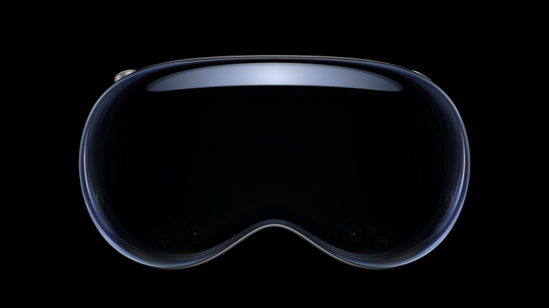
After much anticipation, I finally got my hands on the Apple Vision Pro, February 2nd. Here’s a detailed account of my first weekend with this cutting-edge device.
Passthrough: A Mixed Bag
Apple clearly wanted this to be a set of glasses instead of having to rely on cameras — and I see why that’s the case. I was eager to test out the highly marketed passthrough feature. While it vastly surpasses the black and white feed my Quest 2 provides, it’s not without its flaws. (And yes, I realize this more directly competes with the Quest 3, but I waited for the Vision Pro instead of upgrading my Quest) The camera feed can appear grainy in low light and deciphering text messages on my iPhone proved challenging. However, for general walking navigation and interaction, it performs reasonably well. It’s not quite the crystal clear experience I had envisioned (or had been marketed), but it’s a significant step forward and shows where Apple wants to be in this space — think AR instead of VR.

Crystal Clear Screens
The screens are where the Vision Pro truly shines. The clarity and vibrancy of content and apps is remarkable. Whether you’re exploring an AR environment or watching a video, the immersive quality of the screens makes it easy to forget you’re viewing digital content. In fact, I like to work in a semi-immersed environment to mask most of the grainy-ness I see in passthrough. Semi-immersed so I can still see my keyboard and trackpad.
Mac Virtual Display: A Productivity Boost
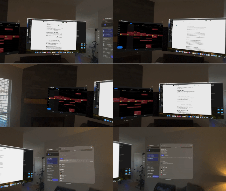
The Mac Virtual Display has been a major productivity boost and is my main use case for buying the Vision Pro. While it currently only supports one monitor, the ability to enlarge the display to accommodate multiple tasks is a significant advantage. The seamless integration of keyboard and mouse use across Mac/iPad/Vision Pro apps further enhances productivity and mostly negates the need for those additional monitors. Being able to look at an app window and a cursor appears to use a trackpad and keyboard is pretty magical. The gaze tracking and navigation by look don’t translate over to the Mac you’re sharing, but I imagine it could be a more frustrating experience than just using an input device anyways.
AR Objects and Tracking: Spot On
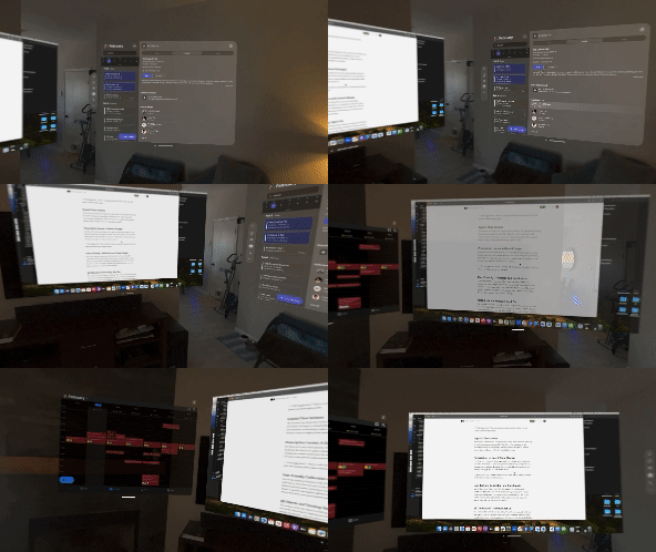
The realism of the AR objects and windows are striking. They blend seamlessly with the real world, matching the lighting and shadows perfectly. The tracking is equally impressive — once you place an AR object, it stays firmly locked in place, adding to the overall sense of immersion. It’s an odd experience to get up and walk through your workspace. When I return, it’s exactly as I left it. Fun fact — you can actually see and interact with your windows from a totally different room, though the backs of the windows are blank.
Prescription Lenses: A Game Changer
For those of us who wear glasses, the option to have prescription lenses built into the device is a game changer. The visual clarity is unparalleled, making the overall experience far more comfortable and enjoyable than having to wear glasses underneath the device. No matter where I look, it’s clear — an experience I haven’t been able to have with other headsets.
Hand Navigation: Minority Report Vibes
Hand navigation offers a unique and intuitive way to interact with the digital world. There’s a bit of a learning curve. You become keenly aware that you move your eyes quicker than the finger tap action. But once you master it, it feels like you’ve stepped into a scene from Minority Report. You can directly interact with the UI by simply tapping on it floating in space, but it feels more tedious than just using your eyes.

User-Friendly Calibration and Guest Mode
One of the standout features of the Vision Pro is its user-friendly calibration. Each time you put on the device, it quickly adjusts to your fitment and placement, ensuring a consistently clear view. The “Guest Mode” is another thoughtful addition that allows others to try out the device with their own personalized calibration. You can even mirror the Vision Pro to a nearby Apple TV to share the experience. Note that videos and immersive experiences won’t work while mirroring. I’ve found that most people pick up on the navigation paradigms pretty quickly.
Immersive Experiences: Heart-Pounding Excitement
The Apple TV+ immersive experiences are nothing short of breathtaking. Watching a high-lining video, I felt as though I was standing right next to the performer, my heart rate spiking with each precarious step she took. And I have the receipts — I received 2 high heart rate warnings from my Apple Watch just standing there watching.

Comfort: Surprisingly Good
Despite its weight, the Vision Pro is surprisingly comfortable for extended use — with the dual band (It feels like they included the single band only because they spent so much time making it look good). I spent several hours coding on Sunday without any discomfort, which also speaks volumes about the device’s ability to prevent motion sickness and headaches. In every other headset I’ve used, I can guarantee a headache or some wooziness after about 30 minutes of use. Even as I write this article after a couple hours of use, I’m still feeling comfortable.
Refresh Rate: Room for Improvement
That’s not to say it’s perfect — The refresh rate is one area where there’s room for improvement. If you move your head too quickly, the view takes a moment to settle and clear up. It’s not a deal-breaker, but it’s something I hope Apple continues to refine in future iterations of the software and hardware.
Persona: Needs Work
I didn’t know what to expect from my persona, but I didn’t expect that. After a second scan, I’m using a persona that I find acceptable, but it still falls short of the quality demonstrated by Meta. It’s a feature that needs some refinement to get out of uncanny valley.

App Selection
We’re still in the very early stages of the product. Remember how the first generation iPad had mostly stretched iPhone apps in the beginning? That’s the Vision Pro selection now — albeit a lot better due to iPad apps already taking advantage of the larger real estate Vision Pro windows provide. There have been some big names waiting on putting development effort into the Vision Pro, but I see this as only temporary as people get their hands (and eyes) on the device and developers learn how to push the envelope of spacial expereinces.
Final Thoughts
All in all, the Apple Vision Pro is an impressive piece of technology. While it has its shortcomings, this is a first generation device. It’s a promising start for what could be the device that gets the general public excited about AR/VR. After I have more time with the device I’ll post a more in depth assessment of how it’s fitting my needs — including productivity, battery life, and more. It’s been an exciting first weekend, and I’m looking forward to seeing how this device evolves.
Share:
Categories
tags
Related Posts

AI and the Future of Restaurant Hospitality

The Value of Agency Project Managers


