Published by
Welcome to The App Faceoff, a Bottle Rocket series in which we perform a digital experience review across two apps in the same industry to explore how they stack up in areas such as design, customer engagement and growth.
At Bottle Rocket, we specialize in building and growing digital experiences for leading brands in a variety of industries. Each of the analysis points for this App Faceoff are measurable areas that should be considered when evolving and growing a digital experience, such as a mobile app, website, or kiosk. Read the latest App Faceoff here!
User Acquisition
Although American Airlines’ app sees more downloads due to its larger customer base, Alaska Airlines’ app enjoys significantly higher user engagement. Despite American having five times more passengers, Alaska’s app boasts a 50% higher rate of daily active users. This suggests that Alaska Airlines passengers are more likely to utilize the app for their travel needs.
Check out page 4 to see a deep dive into how each brand performs.

Day-of-Travel: Tech Spotlight
To ensure a fast and reliable user experience, both American Airlines and Alaska Airlines have invested in native app development, utilizing UIKit and SwiftUI for optimal performance and integration with OS-specific features like push notifications and voice assistants. This commitment to technical excellence is further evidenced by their frequent updates, ensuring bug fixes, new features, and seamless integration with industry-leading analytics and engagement platforms like Adobe and Airship.
Day-of-Travel: Customer Engagement
From checking in to finding your gate to locating your baggage carousel, there are many steps that travelers must make throughout their airport journey. One way these airlines help facilitate these touchpoints is by leveraging push notifications via their mobile apps. So now, rather than periodically needing to check the flight boards in the terminal, passengers get a notification when their gate has changed.

Day-of-Travel: Customer Feedback
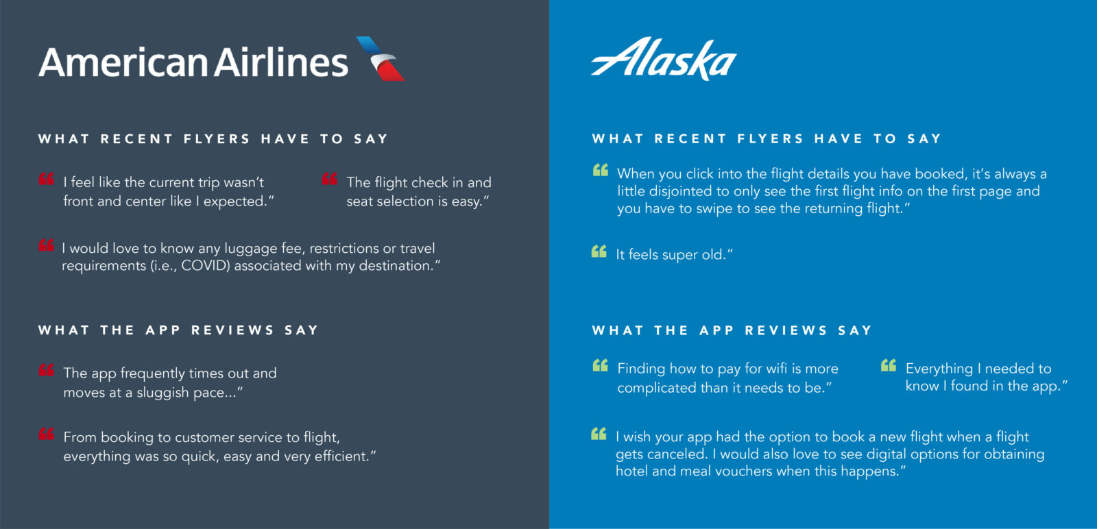
Based on a combination of internal surveys and app store review analysis, it’s clear that both American Airlines and Alaska Airlines apps, while generally well-regarded, suffer from fundamental functionality issues that negatively impact the user experience. Common complaints include problems with boarding pass storage, unexpected seat changes, payment processing, inability to save traveler information, booking glitches, and difficulties with flight changes and cancellations.
Travel Booking
Next, we will examine how well each app is designed to encourage and facilitate the booking experience. We’ve reviewed the mobile booking flow and evaluated the screens and flow of each app to assess their ability to convert users.
Strengths
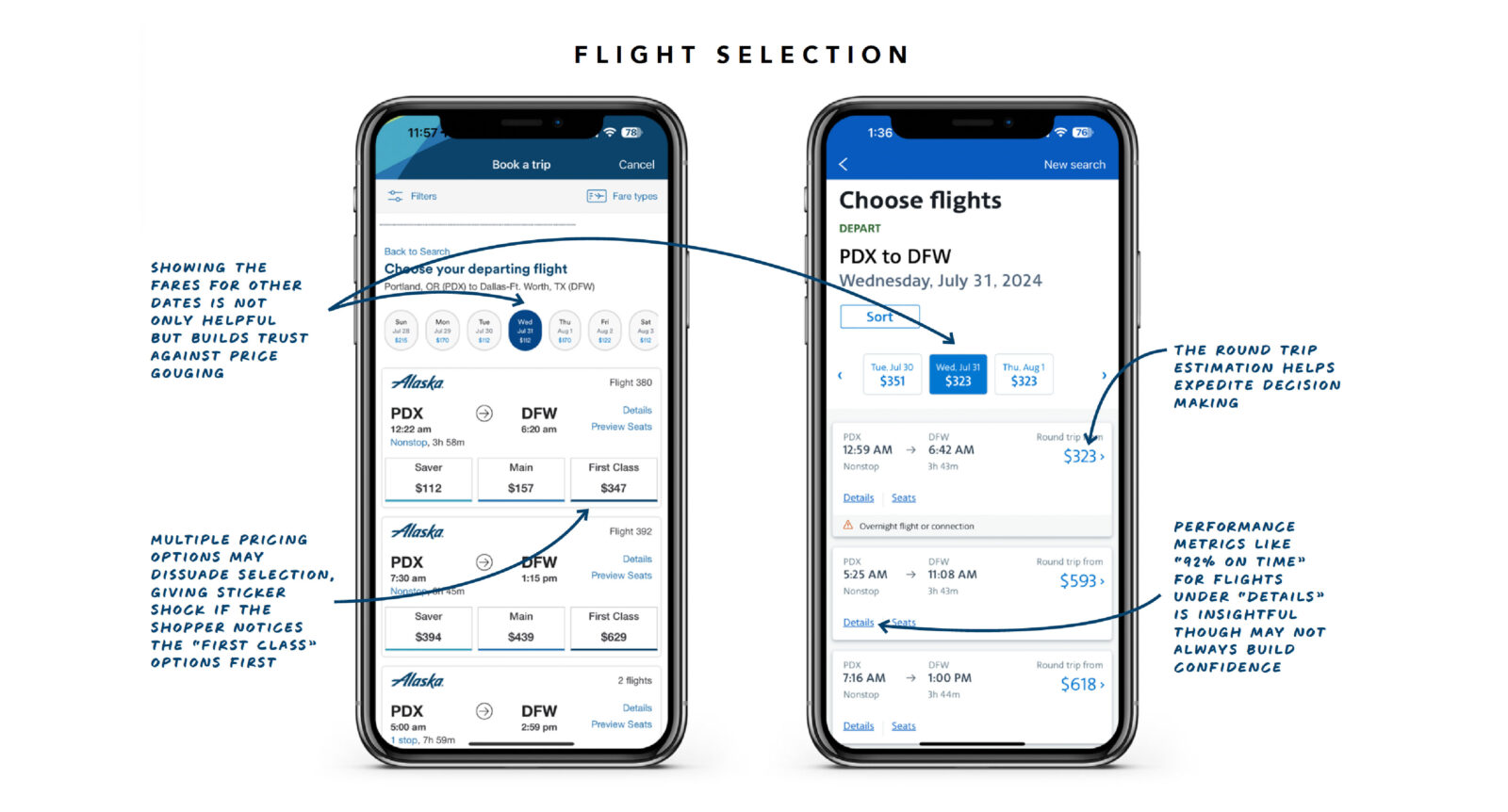
- Multiple payment options, including Apple Pay, make checkout much faster and seamless
- Clean designs with strong text hierarchy and use of color enhance legibility and navigation while reinforcing the Alaska brand identity throughout the experience
- Details like pricing for other travel days and comprehensive flight summaries aid the booking decision-making process
Areas for Improvement
- In general, Alaska provides more detailed information throughout the booking flow while American tends to hide details in accordions and links. For a seasoned traveler booking on mobile, Alaska might look for ways to simplify the amount of details, as well as ways to expedite the checkout process, such as pinned checkout buttons.
- Alaska also doesn’t feature as many “add-ons” or limited-time offers throughout the booking process as American does which may be a great opportunity to encourage more credit card signups, WIFI access subscriptions, etc.

Strengths
- Round trip fare estimation and flight arrival time performance metrics help to improve decision-making and build confidence
- Large, descriptive calls-to-action (CTAs) help encourage users towards their most common actions, especially booking
- Multiple opportunities for upgrades and limited-time offers to encourage additional purchases
Areas for Improvement
- American could benefit from simplifying its visual design by reducing visual noise caused by busy backgrounds on certain screens. Streamlining the navigation and focusing on clarity would enhance the overall user experience, especially on mobile devices, where quick and intuitive navigation is essential.
- While American features numerous “add-ons” and limited-time offers, which are effective for upselling, there’s an opportunity to improve personalization, such as tailoring AAdvantage Program prompts based on membership status, to better engage customers and encourage additional purchases.
See pages 9 & 10 for a deep dive.
Loyalty
The loyalty programs on both airlines are very similar and operate primarily off of a miles-based system based on purchases and flying. Both airlines have a robust loyalty and frequent flyer program which is to be expected from leading airlines that are both part of The oneworld Alliance. Both airlines have integrated their loyalty program into their app well, but there are opportunities for Alaska to make personalized offers and rewards more prominent throughout the digital experience.
Whats Next?
Over the past several weeks, we’ve thoroughly evaluated the Alaska Airlines and American Airlines apps, and we’ve enjoyed both experiences, especially those who were able to take trips and vacations as part of this endeavor. Each brand demonstrated unique strengths in our review, showcasing their maturity in the digital space. However, there are areas for improvement that we’ve identified that both might implement to enhance engagement and adoption within their digital experiences.
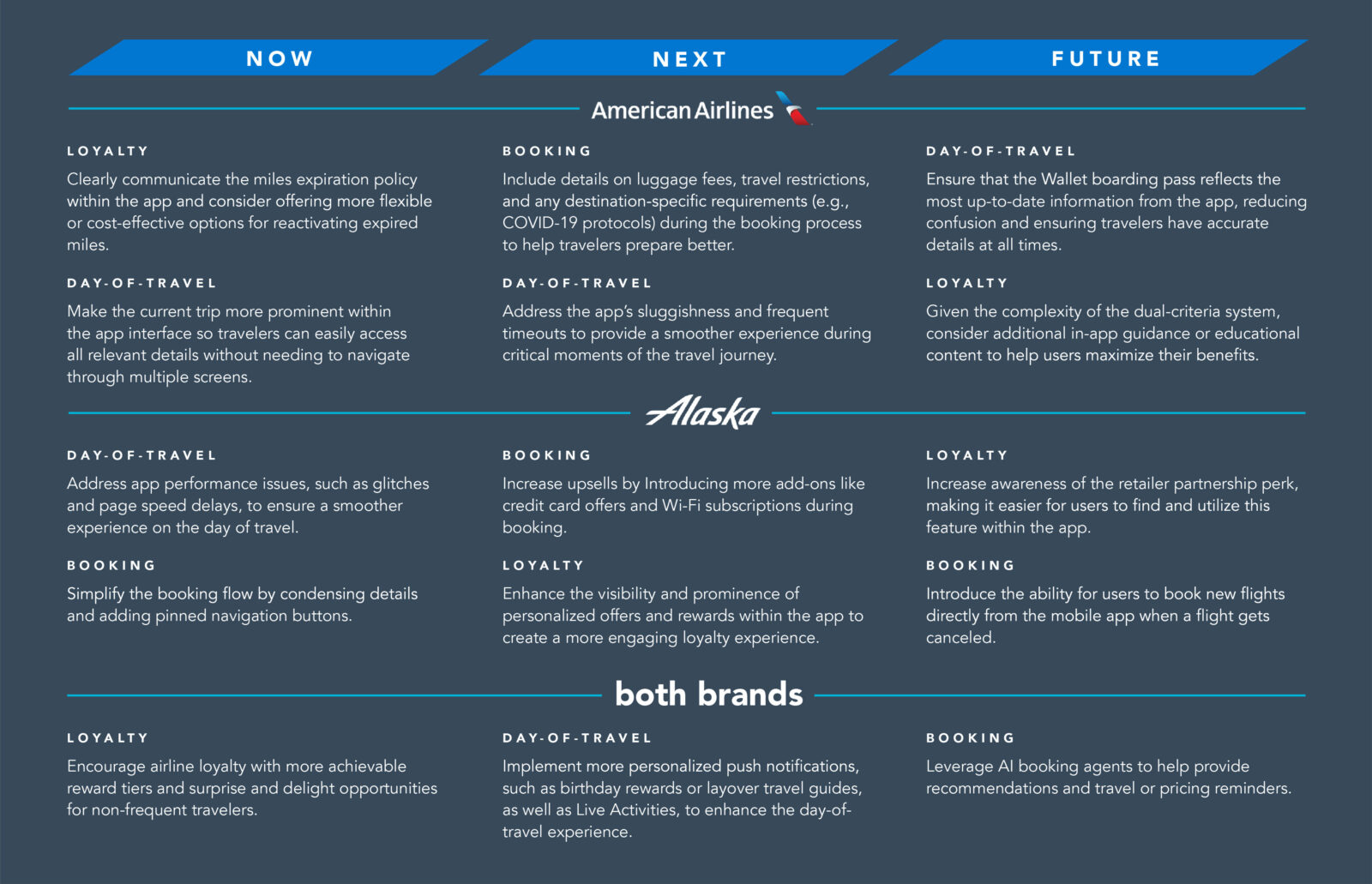
For a closer look, check out page 12.
As technology experts with our heads in the cloud (literally), we’re excited about where airline apps are headed. Here are even more ideas that we anticipate seeing in the future of digital travel experiences:
- AI booking agents know your preferences better than you do, sending personalized recommendations and pricing reminders before you even think to ask.
- Dynamic pricing alerts to keep your wallet happy with real-time price drops.
- Store your passports and visas in-app, get expiration reminders, and collect cool virtual travel stamps as you globe-trot.
- Airport wayfinding provides turn-by-turn directions and gate distance updates with handy push notifications.
- Personalized in-flight experiences and travel tips from your favorite snacks, meals, and drinks to destination recommendations and a community where you can share hidden gems with fellow travelers.
The future of airline apps is looking bright, and we’re here to make sure it’s as smooth as a first-class upgrade!
If you’re looking to elevate your brand’s digital presence, our team is ready to provide the guidance and strategies needed for exceptional results. Contact us to learn more today!
Did you miss the last App Faceoff? Check out our comparison of Raising Canes and Popeyes.
Share:
Categories
tags
Related Posts


The Great Big Budget Cut: Prioritization


